
Coles App
1-week sprint . Concept Project. Solo project
Overview
Coles is one of the two most popular grocery chains in Australia. Along with Woolworth, they are a duopoly of supermarkets, with one situated in every corner.
While researching and analysing the App, I checked their google reviews; I could see a problem space emerging. The underlying message hidden beneath all the harsh reviews was a need for a UX intervention to address the customers' pain points in their shopping experience. As a UX designer, I decided to analyse the App and propose possible solutions to address the various pain points.
The current Coles app has low ratings, and is struggling with several usability issues

Key issues discovered with the current Coles app
Google app reviews were a great way to identify the various user pain points from diverse users. Several people had a lot in common to say. To sort out the commonalities, I employed the affinity map to group the pain points and addressed them individually.


Lots of clicking & scrolling, navigating for items isn’t easy
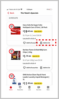
No straightforward way to see specials
No ability to organise or search by category, by specials or filtering
No ability to create multiple lists or clear the whole list to reuse
Usability testing with the current Coles app revealed similar problems
After 3 usability tests, I discovered:

The app employs one method of finding products: Via search bar

there is a long list for milk (186 products) a long vertical scorll

User needs to connect to the website & has to log in again
After add to list there is no sign that shows the item is listed
How might we simplify the process for shopping with the Coles app?
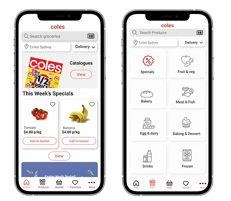
Most grocery websites and apps use Linking and Searching methods, But Coles has a searching method. I decided to design a linking method for the app because Linking is filtering through categories to reach the desired product, employed most successfully in online retail platforms.
First Design
After 3 usability tests with the first attempt, I discovered:

-
Location and search are similar to each other
-
It's difficult for users to find a specific item from specials, Lots of scrolling.

-
Users wanted to choose skim milk, after they chose milk in the category page they needed to scroll down

-
Visualisation of Items is needed
Final Design
There are two ways to search the products
-
Searching via the search bar
-
Linking method via tab bar
Adding visual aids to the product page
Users can recognise the categories faster than reading the names of the aisles.

Adding product subcategories for faster navigation
The redesigned version allows the user to make that decision while browsing through products by employing quick filters.
Providing feedback for when items have been added to the basket